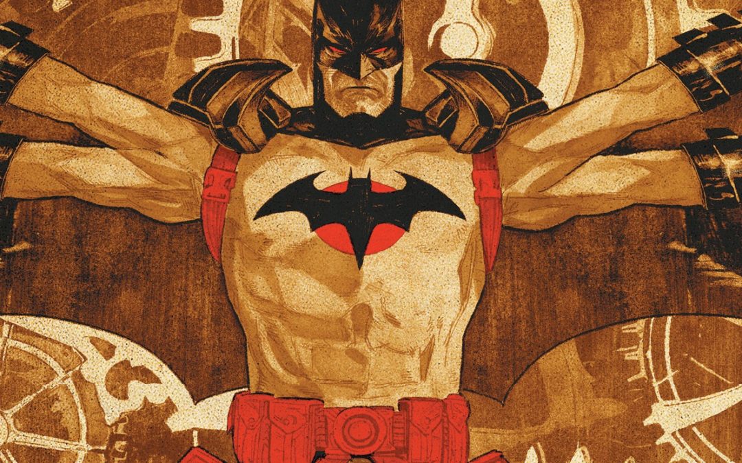
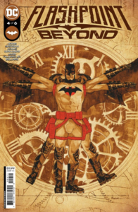
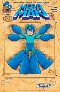
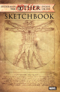
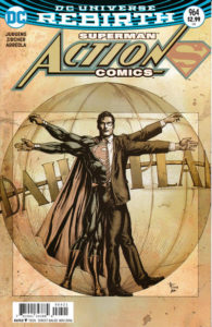
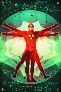
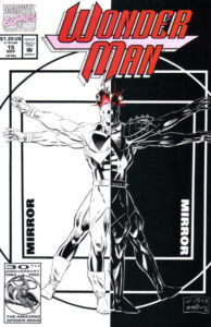
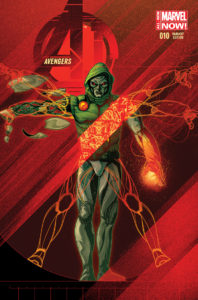
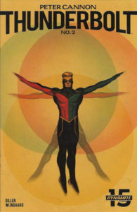
This week’s Flashpoint Beyond #4 continues the story of one of DC Comics’ most popular alternate realities (and maybe more Dark Crisis tie-ins?). It also continues the tradition of Leonardo da Vinci’s famous Vitruvian Man sketch showing up on the cover of a comic book.
Vitru-whovian Man?
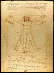
While he put it to paper, Leonardo named the sketch after the observations of Marcus Vitruvius Pollio, a Roman architect from the time of Caesar Augustus (ca. 80 – 70 BCE – 15 BCE). Vitrivius’ observations about the proportions of a human being were among the first ever recorded and included many different ratios:
- From the chin to the top of the forehead is 1/10 the person’s height.
- From the wrist to the tip of the middle finger is also 1/10 height
- From the chin to the crown of the head is ⅛ height
- From the bottom of the neck (in line with the tops of the shoulders) is ⅙ height
- MId-chest to the top of the head is ¼ height
- The length of the foot is ⅙ height
- The length of the forearm is ¼ height
- The breadth of the chest is ¼ height
And, of course, the circle thing. As Vitruvius wrote in Book III of his Ten Books on Architecture, “For if a man be placed flat on his back, with his hands and feet extended, and a pair of compasses centered at his navel, the fingers and toes of his two hands and feet will touch the circumference of a circle described therefrom. And just as the human body yields a circular outline, so too a square figure may be found from it. For if we measure the distance from the soles of the feet to the top of the head and then apply that measure to the outstretched arms, the breadth will be found to be the same as the height, as in the case of plane surfaces which are perfectly square.”
As a result, Vitruvius’ Vitruvian Man looked like this:
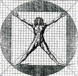
To make the human figure fit in both the circle and the square, the hands and feet needed to be stretched, or “mildly Cronenberged.” (Cesare Cesariano, Vitruvian Man, Woodcut, 1521)
Vitruvius pointed out that the measurements didn’t originate with him but instead came largely from his observations of the work of sculptors and artists of antiquity.
Over the centuries since he put the ideas to paper, Vitruvius’ man was illustrated by countless artists, but da Vinci’s is the one that stands out. No shade-throw at modern comic book cover artists intended.
LEONARDO’S OG VITRUVIAN MAN
First sketched around 1490 by da Vinici, scholars still debate whether it’s worth the title used by the artist. Leonardo pointed out (and his illustration reflects as much) that Vitruvius’ square and circle cannot have the same center. At least with humans as we know them. As a result, Leonardo’s figure is centered at the groin rather than the navel, pulling the square down so it doesn’t rest inside the circle. Along with centering the figure differently, Leonardo showed the figure with hands raised to the top of its head and then superimposed on the image on top of the other. The result is a figure with 16 different poses that owes as much or more to Leonardo as it does to Vitruvius.
Also a scientist, Leonardo based his Vitruvian Man on data. He took meticulous measurements of Italian models and let that inform his final result. One cool note on Leonardo’s version is that the text at the bottom and the top is in his iconic “mirror writing.” It’s written backward on the page but can be read normally by viewing the reflection of the text in a mirror.
While based on the work of the ancient architect, Leonardo’s Vitruvian Man was a radical statement for his time, one of the countless thought-bombs of the Renissance. The image put man at the center of two perfect shapes: the circle and the square. Man was not a passive player in the universe, ever at the mercy of celestial powers; rather, he was in control of his fate, his community, and the world. In line with Humanist ideals of the age, Leonardo’s work shows that man — in body, mind, and soul — is the center of the universe.
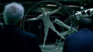
On that last one, perhaps HBO’s Westworld employs the Vitruvian Man motif the best. In the series, the robotic hosts produced by Delos, first to populate the park and then in later seasons to take over the earth – are meant to be perfected versions of their human “ancestors.” What better way to show them as perfect than to put them in a pose tied to the ideal human proportions?
WHY DOES THIS KEEP SHOWING UP?
Art is hard, and established proportions are a quick cheat for drawing people?
Okay – that’s over-simplifying, but the core is there.
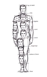
Lessons on drawing the human body (and many other animals) rest on proportions. Vitruvias’ list of proportions from Ten Books on Architecture only documents some of the proportions artists and other observers have realized over the centuries. For example, the pelvis’s width is the head’s height plus one-third of the face. The width of the foot is one-half the height of the head. The list goes on and on, most often expressing the human form in terms of the head as a unit of measurement.
It’s also eye-catching on the stands, amid a sea of other covers, blending into a wall of color. It pops, even with the familiarity that it carries. It’s also a way to produce a character reference pose and can suggest meaning for the story inside. In Flashpoint Beyond #4, for instance, Thomas Wayne is hunting the Clockwork Killer, so a clockwork theme informs the inside the circle. While there is no iconic square with Batman in the image, the character is a natural for a Vitruvian homage, given Wayne’s obsession with physical and mental perfection.
As for other comics, How about a quick gallery…

Marvel Anatomy: A Scientific Study of the Superhuman (Insight Editions)
And that’s just a start. If you’re looking for a theme to your comics collecting, there are worse.
Make Vitruvian Man a character and put him inside a comic? Sure…been there. And the results were…troubling. The character “Vitruvian Man” (Piero Rosci) showed up in DC Comics’ relaunched Stormwatch series in issue #9 by Peter Milligan and Miguel Sepulveda. Rosci had been changed by a former incarnation of Stormwatch, based on da Vinici’s drawing. Yeah.
For equally horrifying measure, a giant “Vitruvian Man” showed up in Boom Studio’s Mighty Morphin’ Power Rangers #5, with predictably horrifying results.

Where did he get the giant crossbow and sword? And why? And thank you artist for not showing his junk. #somanyquestions (Boom)
Probably should point out here that using Vitruvian Man for a body horror character is about as 180 degrees as you can go from the original intent of both Vitruvius, Leonardo, and every artist who’s tried to make their own representation. Vitruvian Man does not have four arms. A human with four arms is not the ideal.
And if you’re really keeping track, Leonardo himself is a major figure in the history of the Marvel Universe…first appearing in 1956’s Mystery Tales #41, and then pulled into the history of SHIELD by Jonathan Hickman and a variety of other creators in SHIELD series starting in 2010.
And, of course, there are millions of fan-produced homages and pastiches out there. While we couldn’t find anything that was official, the one that makes the most sense is:
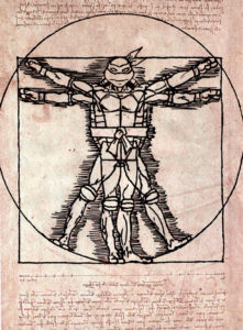
Leonardo as Vitruvian Man, art by Flam-On
STEM LEARNING APPLICATIONS
Vitruvian Man is at the heart of the often used wingspan-to-height measurement/graphing exercise.
Using the classic Vitruvian Man as an example (warning – it shows his junk, out there for everyone to see), have students measure their wingspan (middle fingertip to middle fingertip) and their shoeless height. While individual measurements will vary from student to student, when the class data is graphed, a trend will be easy to spot. A quick calculation shows that the slope of the data is close to 1.
Some studies report that, on average, the male wingspan to height ratio is greater than 1, while that of women tends to be closer to Leonardo’s expected value. In males, sometimes this difference is extreme – in the 2019 NBA Draft Combine, Tacko Fall’s measurements came in with an 8-foot, 2.25-inch wingspan compared to a height of 7 feet, 5.25 inches. That’s circle-busting as far as Vitruvian Man is concerned, but not close to the record holders. According to Rookie Wire, seven players have wingspans that are ten inches (or more) larger than their heights, with the record held by Doug Wren, whose wingspan was 13.75 inches greater than his height of 6 feet, 5.75 inches.
A wingspan-to-height ratio of greater than one doesn’t land you a starting position, though. Wren went undrafted by the NBA in 2003 but did play basketball for teams in Iceland, Montenegro, and Korea.
In many sports, the difference between wingspan and ratio is referred to as the “ape index,” and high values are seen in MMA fighters, boxers, and mountain climbers, to name a few.
Scientific American has an excellent outline for activities (along with images of a clothed Virtruvian figure) here. Still, you’ll need to adjust and adapt for whole-class activities that tie in a slope calculation. Better yet – build your own, integrating data collection, graphing, finding reliable online resources, and a template for students to draw themselves, a character, or a data outlier as Vitruvian Man.
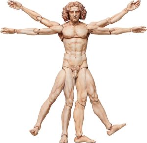
Final note – of course, there’s an action figure.
And, of course, it’s horrifying.


